Take a look at the screenshot below:

There are three columns, each one of them contains one image and one paragraph. After adding few lines of CSS take a look at below screenshot. Which one looks better?
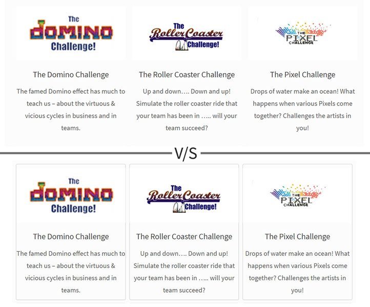
Second one right! Because information is so much clearer.
This effect can be achieved using CSS.
How To Add Box Shadow Effect Using CSS:
Step – 1:
Wrap your content into div tag
<div class=”bs”></div> [bs means Box Shadow]
Step – 2:
Go to WordPress Dashboard > Appearance > Customize > Additional CSS – Copy & paste the below CSS. Note: Alternatively you can also use any plugin to add custom CSS into your theme. Both methods will give the same result.
.bs {
border: 1px solid #DDD;
border-radius: 4px;
box-shadow: 0 1px 3px rgba(0,0,0,0.055);
}
Hit Save and you are good to go. But if you want to customize or want to dive deep into code let me explain how this effect is achieved.
First Line:
.bs { border: 1px solid #DDD; }
This line creates a border around the div tag which in my case is a rectangle.
1px : width of the border. You can increase the value according to your requirement.
solid : border style. You can choose other border options like:
dotted – Defines a dotted border
dashed – Defines a dashed border
solid – Defines a solid border
double – Defines a double border
groove – Defines a 3D grooved border. The effect depends on the border-color value
ridge – Defines a 3D ridged border. The effect depends on the border-color value
inset – Defines a 3D inset border. The effect depends on the border-color value
outset – Defines a 3D outset border. The effect depends on the border-color value
none – Defines no border
hidden – Defines a hidden border
#DDD : Color of the border.
Second Line:
.bs { border-radius: 4px; }
Did you notice round corners of the border? Those are because of this line. Increasing the value in pixels will make corners more round. You can adjust it according to your requirement. You can also adjust the value of each corner by defining it separate like:
.bs {border-radius: 1px 2px 3px 4px;}
.bs {border-radius: top right bottom left;}
Third Line:
.bs { box-shadow: 0px 1px 3px 0px rgba(0,0,0,0.055); }
It adds little shadow to the content. You may need to increase value in order to make it more noticeable. But it’s okay. We will add little effect later.
.bs {box-shadow: top right bottom left Color;}
By adding this CSS your content will look like this –

Now in order to take this effect to next level, let’s add some hover effect so that it can look like this-

How to add hover effect to an element:
Above effect can be achieved using CSS-
.bs:hover {
box-shadow: 0 2px 15px 5px rgba(0,0,0,.2);
transition: box-shadow .2s cubic-bezier(.15,.69,.83,.67);
}
This code will increase box-shadow value & a smooth transition on hovering the mouse on that element.
You have to play around a little bit in order to make that effect fit according to your need. Possibilities are endless.
In comment section share how you have used this effect. Subscribe & Share it with you friends.